Employee Churn Prediction with Classification Models
Scenario
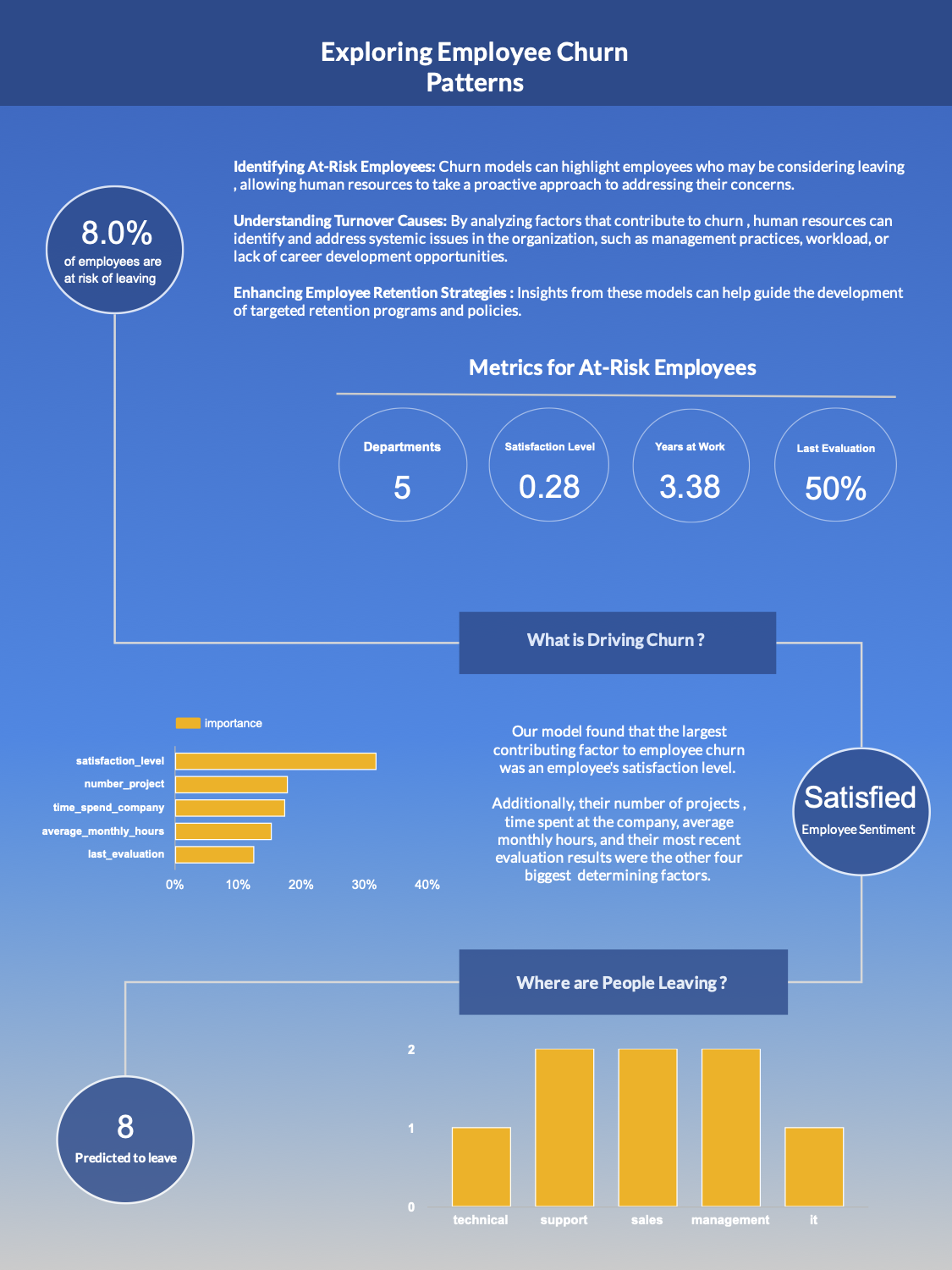
We are aiding a company that is having problems retaining employees. We are here to proactively identify employees that are of high churn risk.
Objective. Build a machine learning model trained on previous data that can predict a new employee’s likelihood of leaving.
Deliverable form: A report/dashboard
Analysis Questions
- What is causing employees to leave ?
- Who is predicted to leave ?
- Are employees satisfied ?
- What departments have the most churn ?
Data Sources
Training data: tbl_hr_data.csv
Data for analysis: tbl_new_employees.csv
Tools Utilized
Required Libraries (Python)
Since we will be developing our model in Google Colab, we have a number of libraries that we will import and utilize in the project.
pandas: For data manipulation and analysis.numpy: For numerical operations, especially for handling arrays and mathematical functions.scikit-learn: For machine learning models (linear regression & multiple linear regression), data splitting, and evaluation metrics.seaborn: For advanced statistical data visualization.matplotlib.pyplot: For creating static, interactive, and animated visualizations.
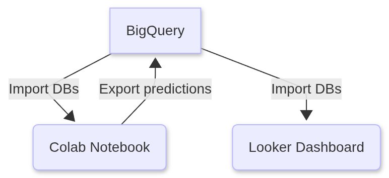
1. Google BigQuery: Creating a table view
We began by uploading the following CSVs to Google BigQuery and importing their data into tables.
tbl_hr_data.csv - The historical data that we will use to train and test our models on.
tbl_new_employees.csv - The actual data which our model will run its predictions on for our client.
1
2
3
SELECT * ,"Original" as Type FROM `my-project-echurn102025.employeedata.tbl_hr_data`
UNION ALL
SELECT * , "Pilot" as Type FROM `my-project-echurn102025.employeedata.tbl_new_employees`
We proceeded to save the results of this query as a view in Google BigQuery named tbl_full_data
2. Google Colab: Connect to BigQuery
Remark. You can confirm the soundness of the code snippets below by downloading a copy of the Jupyter notebook that contains all of the code below.
1
2
3
4
5
6
7
8
9
from google.cloud import bigquery
from google.colab import auth
import numpy as np
import pandas as pd

auth.authenticate_user()

project_id = 'my-project-echurn102025' #project id from BigQuery
client = bigquery.Client(project = project_id , location = 'US')
1
2
3
4
5
datatset_reference = client.dataset('employeedata' , project = project_id)
dataset = client.get_dataset(datatset_reference)
table_reference = dataset.table('tbl_hr_data')
table = client.get_table(table_reference)
table.schema
1
2
3
4
5
6
7
8
9
10
11
[SchemaField('satisfaction_level', 'FLOAT', 'NULLABLE', None, None, (), None),
 SchemaField('last_evaluation', 'FLOAT', 'NULLABLE', None, None, (), None),
 SchemaField('number_project', 'INTEGER', 'NULLABLE', None, None, (), None),
 SchemaField('average_montly_hours', 'INTEGER', 'NULLABLE', None, None, (), None),
 SchemaField('time_spend_company', 'INTEGER', 'NULLABLE', None, None, (), None),
 SchemaField('Work_accident', 'INTEGER', 'NULLABLE', None, None, (), None),
 SchemaField('Quit_the_Company', 'INTEGER', 'NULLABLE', None, None, (), None),
 SchemaField('promotion_last_5years', 'INTEGER', 'NULLABLE', None, None, (), None),
 SchemaField('Departments', 'STRING', 'NULLABLE', None, None, (), None),
 SchemaField('salary', 'STRING', 'NULLABLE', None, None, (), None),
 SchemaField('employee_id', 'STRING', 'NULLABLE', None, None, (), None)]
1
2
table_reference_new = dataset.table('tbl_new_employees')
table_new = client.get_table(table_reference_new)
1
2
3
#create dataframes from BigQuery tables
df = client.list_rows(table = table).to_dataframe()
df2 = client.list_rows(table = table_new).to_dataframe() #contains unseen final data to be used for predictions
1
2
df.info()
df2.info()
1
2
3
4
5
6
7
8
9
10
11
12
13
14
15
16
17
18
19
20
21
22
23
24
25
26
27
28
29
30
31
32
33
34
35
36
<class 'pandas.core.frame.DataFrame'>
RangeIndex: 15004 entries, 0 to 15003
Data columns (total 11 columns):
 #   Column                 Non-Null Count  Dtype
---  ------                 --------------  -----
 0   satisfaction_level     15004 non-null  float64
 1   last_evaluation        15004 non-null  float64
 2   number_project         14999 non-null  Int64
 3   average_montly_hours   15004 non-null  Int64
 4   time_spend_company     14999 non-null  Int64
 5   Work_accident          15000 non-null  Int64
 6   Quit_the_Company       15004 non-null  Int64
 7   promotion_last_5years  15004 non-null  Int64
 8   Departments            15004 non-null  object
 9   salary                 15004 non-null  object
 10  employee_id            15004 non-null  object
dtypes: Int64(6), float64(2), object(3)
memory usage: 1.3+ MB
<class 'pandas.core.frame.DataFrame'>
RangeIndex: 100 entries, 0 to 99
Data columns (total 11 columns):
 #   Column                 Non-Null Count  Dtype
---  ------                 --------------  -----
 0   satisfaction_level     100 non-null    float64
 1   last_evaluation        100 non-null    float64
 2   number_project         100 non-null    Int64
 3   average_montly_hours   100 non-null    Int64
 4   time_spend_company     100 non-null    Int64
 5   Work_accident          100 non-null    Int64
 6   Quit_the_Company       100 non-null    Int64
 7   promotion_last_5years  100 non-null    Int64
 8   Departments            100 non-null    object
 9   salary                 100 non-null    object
 10  employee_id            100 non-null    object
dtypes: Int64(6), float64(2), object(3)
memory usage: 9.3+ KB
Here you can see that our training data is quite large relative to the data in df2 which we will be using for our final predictions.
3. Data preprocessing
Tasks performed
- One-hot encoding categorical features (salary and department)
- Changing the case of features to lower case
- Fixing any typos or inconsistent feature names
1
2
3
4
5
6
7
8
9
10
11
12
13
14
df_processed = pd.DataFrame(df)
df2_processed = pd.DataFrame(df2)

df_processed = pd.get_dummies(df, columns=['salary','Departments'],prefix=['salary','department'],prefix_sep='_' , dtype = int)
cols= df_processed.columns.tolist()
df_processed.columns = [x.lower() for x in cols]
df_processed.columns

#2nd dataframe

df2_processed = pd.get_dummies(df2, columns=['salary' , 'Departments'], prefix =['salary', 'department'] , prefix_sep='_' , dtype =int)
cols2 = df2_processed.columns.tolist()
df2_processed.columns = [x.lower() for x in cols2]
df2_processed.columns
1
2
3
4
5
6
7
8
9
Index(['satisfaction_level', 'last_evaluation', 'number_project',
       'average_montly_hours', 'time_spend_company', 'work_accident',
       'quit_the_company', 'promotion_last_5years', 'employee_id',
       'salary_high', 'salary_low', 'salary_medium', 'department_it',
       'department_randd', 'department_accounting', 'department_hr',
       'department_management', 'department_marketing',
       'department_product_mng', 'department_sales', 'department_support',
       'department_technical'],
      dtype='object')
1
2
df_processed.rename(columns = {"average_montly_hours" : "average_monthly_hours"}, inplace = True)
df2_processed.rename(columns = {"average_montly_hours" : "average_monthly_hours"},inplace = True)
4. Build Models
Now we will initialize three different classification models and assess which one is the best choice for our particular use.
Models:
1
2
3
4
5
6
7
8
9
10
import seaborn as sns
import matplotlib.pyplot as plt
from sklearn.model_selection import train_test_split , GridSearchCV , StratifiedKFold
from sklearn.preprocessing import StandardScaler
from sklearn.ensemble import RandomForestClassifier
from sklearn.neighbors import KNeighborsClassifier
from sklearn.decomposition import PCA
from sklearn.pipeline import Pipeline
from sklearn.svm import SVC
from sklearn.metrics import classification_report, confusion_matrix, accuracy_score
1
2
3
4
5
6
7
8
9
10
11
12
13
14
#create our data frames for training
X = df_processed.drop(columns = ['quit_the_company' , 'employee_id'])
y = df_processed['quit_the_company']

X_train , X_test, y_train, y_test = train_test_split(X , y , test_size = 0.2 , random_state = 42)

nan_total_train = X_train.isnull().sum() #tally NaN values in training data Before processing
nan_total_test = X_test.isnull().sum()


#tally of nan values in our dataframes
print(f"Original number of NaN values in our training dataframe is : {nan_total_train}\n")
print("______________________________________________________\n")
print(f"Original number of NaN values in our testing dataframe is: {nan_total_test}")
1
2
3
4
5
6
7
8
9
10
11
12
13
14
15
16
17
18
19
20
21
22
23
24
25
26
27
28
29
30
31
32
33
34
35
36
37
38
39
40
41
42
43
44
45
Original number of NaN values in our training dataframe is: satisfaction_level        0
last_evaluation           0
number_project            4
average_monthly_hours     0
time_spend_company        4
work_accident             3
promotion_last_5years     0
salary_high               0
salary_low                0
salary_medium             0
department_it             0
department_randd          0
department_accounting     0
department_hr             0
department_management     0
department_marketing      0
department_product_mng    0
department_sales          0
department_support        0
department_technical      0
dtype: int64

______________________________________________________

Original number of NaN values in our testing dataframe is : satisfaction_level        0
last_evaluation           0
number_project            1
average_monthly_hours     0
time_spend_company        1
work_accident             1
promotion_last_5years     0
salary_high               0
salary_low                0
salary_medium             0
department_it             0
department_randd          0
department_accounting     0
department_hr             0
department_management     0
department_marketing      0
department_product_mng    0
department_sales          0
department_support        0
department_technical      0
dtype: int64
Now we’ll optimize our KNN model with the use of pipelines.
1
2
3
4
5
6
7
8
9
10
11
12
13
14
15
16
17
from sklearn.impute import SimpleImputer

#initalize the pipeline and it's transformers / estimators
pipeline = Pipeline(steps=[
('imputer', SimpleImputer(strategy='mean')), #replaces missing values with the mean of the feature
('scaler' , StandardScaler()), #scale the feature values to ensure "equal" contributions to KNN model
('pca', PCA()), #Principal Component Analysis - to reduce features to the minimal set of orthogonal components
('knn', KNeighborsClassifier()) #our KNN model
])

#the PCA and KNN parameters that we will be assessing our model with
param_grid = {'pca__n_components' : [2,3],
              'knn__n_neighbors' : [2,3,4,5,6,7] #number of nearest points used to classify a given observation
              }

#cross validation via 5 Strafied Folds
cv = StratifiedKFold(n_splits = 5, shuffle = True, random_state = 42)
Iterate through the KNN parameters until we find the optimal combination, using GridSearchCV().
1
2
3
4
5
6
best_model_knn = GridSearchCV(estimator = pipeline ,
                          param_grid = param_grid,
                          cv = cv ,
                          scoring = 'accuracy',
                          verbose = 2
                          )
1
best_model_knn.fit(X_train, y_train)
GridSearchCV(cv=StratifiedKFold(n_splits=5, random_state=42, shuffle=True),
             estimator=Pipeline(steps=[('imputer', SimpleImputer()),
                                       ('scaler', StandardScaler()),
                                       ('pca', PCA()),
                                       ('knn', KNeighborsClassifier())]),
             param_grid={'knn__n_neighbors': [2, 3, 4, 5, 6, 7],
                         'pca__n_components': [2, 3]},
             scoring='accuracy', verbose=2)
In a Jupyter environment, please rerun this cell to show the HTML representation or trust the notebook. On GitHub, the HTML representation is unable to render, please try loading this page with nbviewer.org.
GridSearchCV(cv=StratifiedKFold(n_splits=5, random_state=42, shuffle=True),
             estimator=Pipeline(steps=[('imputer', SimpleImputer()),
                                       ('scaler', StandardScaler()),
                                       ('pca', PCA()),
                                       ('knn', KNeighborsClassifier())]),
             param_grid={'knn__n_neighbors': [2, 3, 4, 5, 6, 7],
                         'pca__n_components': [2, 3]},
scoring='accuracy', verbose=2)Pipeline(steps=[('imputer', SimpleImputer()), ('scaler', StandardScaler()),
('pca', PCA(n_components=3)),
('knn', KNeighborsClassifier(n_neighbors=2))])SimpleImputer()
StandardScaler()
PCA(n_components=3)
KNeighborsClassifier(n_neighbors=2)
If we expand the information under the elements of our pipeline (in the GridSearchCV graphic produced in the ouput), we see that our selected parameters were 2 and 3 for the number of nearest neighbors and the PCA components respectively.
Next , we find the accuracy score of our KNN model using the test data.
1
2
test_score = best_model_knn.score(X_test,y_test)
print(f"{test_score:.3f}")
1
0.946
1
best_model_knn.best_params_
1
{'knn__n_neighbors': 2, 'pca__n_components': 3}
Now that we have our ideal KNN model. We’ll return it’s employee churn predictions up ahead. We will also assess how it performed with a Confusion Matrix and some useful metrics.
Lets initialize pipelines for our other classifier models. Specifically a RandomForest Classifier and a Support Vector Machine model.
1
2
3
4
5
6
7
8
9
10
11
pipeline_rf = Pipeline( steps=[
    ('imputer' , SimpleImputer(strategy = 'mean')) , # replace missing values with the mean of the column
    ('scaler' , StandardScaler()),
    ('rfc' , RandomForestClassifier(random_state = 42))
])

pipeline_svm = Pipeline ( steps=[
    ('imputer' , SimpleImputer(strategy = 'mean')) , # replace missing values with the mean of the column
    ('scaler' , StandardScaler()),
    ('svm' , SVC(kernel = 'linear', C=1 , random_state = 42))
])
Train the models
1
2
model_rf = pipeline_rf.fit(X_train, y_train)
model_svm = pipeline_svm.fit(X_train, y_train)
5. Evaluating the Classification Models
Tools & metrics that we will use :
- Confusion Matrices
- Classification Reports :
- Recall
- Precision
- F1-Score
Interpreting Confusion Matrices
Some preliminaries. In this context, since we are assessing the risk of employee churn. A positive corresponds to 1 , i.e. employee churn , negative corresponds to 0, i.e. employee retained.
So a true positive is a correctly predicted case of employee churn while a false positive is the case where our model predicted that a given employee has left when they actually haven’t.
True positive: prediction $= 1 =$ actual value
False positive: prediction $= 1 $ and actual value $= 0$
True negative: prediction $= 0 =$ actual value
False negative: prediction $= 0 $ and actual value $= 1$
1
2
3
4
5
6
7
8
9
10
11
12
13
14
y_pred_knn = best_model_knn.predict(X_test)
y_pred_svm = model_svm.predict(X_test)
y_pred_rf = model_rf.predict(X_test)

model_preds = [y_pred_knn, y_pred_svm , y_pred_rf]
class_algs = ['KNN' ,'SVM', 'Random Forest']

#give us the accuracy score and classification reports for our models
for i, j in zip(model_preds,class_algs) :
  print(f"The accuracy score for {j} is {accuracy_score(y_test, i):.3f}\n" )
  print(f"\n The classification report for {j} is: \n")
  print("\n" , classification_report(y_test, i))
  print(f"______________________________________________________\n")
1
2
3
4
5
6
7
8
9
10
11
12
13
14
15
16
17
18
19
20
21
22
23
24
25
26
27
28
29
30
31
32
33
34
35
36
37
38
39
40
41
42
43
44
45
46
47
48
49
50
The accuracy score for KNN is 0.946


 The classification report for KNN is:


               precision    recall  f1-score   support

         0.0       0.95      0.98      0.96      2281
         1.0       0.92      0.85      0.88       720

    accuracy                           0.95      3001
   macro avg       0.94      0.91      0.92      3001
weighted avg       0.95      0.95      0.94      3001

______________________________________________________

The accuracy score for SVM is 0.770


 The classification report for SVM is:


               precision    recall  f1-score   support

         0.0       0.79      0.94      0.86      2281
         1.0       0.55      0.23      0.32       720

    accuracy                           0.77      3001
   macro avg       0.67      0.58      0.59      3001
weighted avg       0.74      0.77      0.73      3001

______________________________________________________

The accuracy score for Random Forest is 0.991


 The classification report for Random Forest is:


               precision    recall  f1-score   support

         0.0       0.99      1.00      0.99      2281
         1.0       0.99      0.97      0.98       720

    accuracy                           0.99      3001
   macro avg       0.99      0.98      0.99      3001
weighted avg       0.99      0.99      0.99      3001

______________________________________________________
Based on these classification reports I am highly inclined to pick the Random Forest Classifier as our model of choice.
But let’s carry on with the next assessment, the confusion matrices. Which will give us a closer look into the number of true or false positive/negatives in our models’ predictions.
Confusion Matrices
Using a combination of confusion matrices and heatmaps we will visualize a comparison between our models’ predictions.
First we initialize our confusion matrices and then we visualize them using heatmaps from the statstical data visualization library Seaborn.
1
2
3
4
5
6
7
8
9
10
11
12
13
14
15
16
17
18
19
20
21
22
23
24
25
26
27
28
29
conf_matrix_knn = confusion_matrix(y_test , y_pred_knn)
conf_matrix_svm = confusion_matrix(y_test, y_pred_svm)
conf_matrix_rf = confusion_matrix(y_test, y_pred_rf)


fig, axes = plt.subplots(1,3, figsize = (18,7))

#knn heatmap subplot for knn confusion matrix
sns.heatmap(conf_matrix_knn , annot=True , cmap='Blues' , fmt = 'd', ax = axes[0] , xticklabels = 'auto' , yticklabels = 'auto' )
axes[0].set_title("KNN Testing Confusion Matrix")
axes[0].set_xlabel("Predicted")
axes[0].set_ylabel("Actual")

#svm heatmap subplot

sns.heatmap(conf_matrix_svm, annot=True, cmap='Blues' , fmt = 'd' , ax = axes[1] , xticklabels = 'auto', yticklabels = 'auto')
axes[1].set_title("SVM Testing Confusion Matrix")
axes[1].set_xlabel("Predicted")
axes[1].set_ylabel("Actual")

#rf heatmap subplot

sns.heatmap(conf_matrix_rf, annot=True , cmap='Blues' , fmt = 'd' , ax = axes[2] , xticklabels = 'auto' , yticklabels = 'auto')
axes[2].set_title("Random Forest Testing Confusiion Matrix")
axes[2].set_xlabel("Predicted")
axes[2].set_ylabel("Actual")

plt.tight_layout()
plt.show()
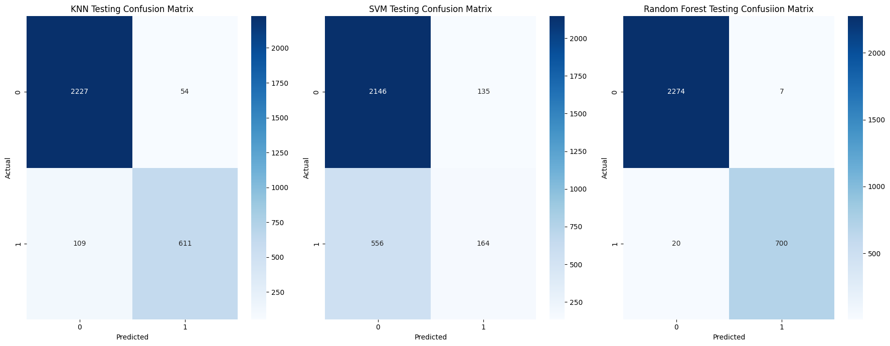
Here we can see that our Random Forest classifier is the better performing of the three models.
To further instill the information discussed prior. We can breakdown the predictions of our Random Forest classifier in the following manner:
- True Positives count: 700
- False Positives count: 7
- True Negatives count: 2274
- False Negatives count: 20
Now the results of our classification report should seem clearer.
Below are the formulas for the metrics in our classification report , in respect to employee churn (1).
\[\text{Precision }= \displaystyle\frac{\text{True positives}}{\text{True Positives} + \text{ False Positives}} = \frac{700}{707} \approx 0.99 \\\] \[\text{Recall }= \displaystyle\frac{\text{True positives}}{\text{True Positives} + \text{False Negatives}} \frac{700}{720} \approx 0.97 \\\]F1 Score - The harmonic mean of precison and recall
\[\text{F1 Score }= \frac{2 \cdot \text{Precision} \cdot \text{Recall}}{\text{Precision} + \text{Recall}} = \frac{(2 \cdot 0.99 \cdot 0.97)}{0.99 + 0.97} \approx 0.98 \\\]We could try to tune the parameters for our SVM model to see if we can improve it’s performance. But “out of the box”, with little to no configuration, our random forest classifier seems best suited for our dataset. We will proceed to use it’s predictions in our upcoming Looker Studio dashboard.
6. Exploring Our Results
Which Features Contribute Most to Employee Churn ?
Now we wish to determine how much each feature in our dataset/dataframe contributes to the probability of us losing a given employee. It’s clear to imagine why not every feature would have equal or similar contribution to the likelihood of an employee leaving an organization.
We will create a separate two column dataframe for this. Which we will eventually export as a table to BigQuery and incorporate into our Looker Studio dashboard.
1
2
3
feat_imps = model_rf.named_steps['rfc'].feature_importances_
df_feats = pd.DataFrame(zip(X_train.columns, feat_imps), columns=['feature', 'importance'])
df_feats = df_feats.sort_values(by='importance' , ascending = False)
1
2
#df_feats.set_index('feature')
df_feats
| feature | importance | |
|---|---|---|
| 0 | satisfaction_level | 0.318813 |
| 2 | number_project | 0.178543 |
| 4 | time_spend_company | 0.174293 |
| 3 | average_monthly_hours | 0.153096 |
| 1 | last_evaluation | 0.125385 |
| 5 | work_accident | 0.011894 |
| 8 | salary_low | 0.006976 |
| 7 | salary_high | 0.005463 |
| 19 | department_technical | 0.003689 |
| 17 | department_sales | 0.003318 |
| 9 | salary_medium | 0.003255 |
| 18 | department_support | 0.002683 |
| 10 | department_it | 0.001881 |
| 6 | promotion_last_5years | 0.001776 |
| 11 | department_randd | 0.001758 |
| 13 | department_hr | 0.001633 |
| 14 | department_management | 0.001583 |
| 15 | department_marketing | 0.001440 |
| 12 | department_accounting | 0.001345 |
| 16 | department_product_mng | 0.001177 |
Lets create a stem chart to better visualize how the importances of each feature compares to one another.
1
2
3
4
5
6
7
plt.stem(df_feats['feature'] , df_feats['importance'] , orientation = 'horizontal', basefmt = '' )
plt.title('Quantified Importances of Features')
plt.ylabel('Features')
plt.xlabel('Feature Importance')
plt.gca().invert_yaxis() #reverse the default asecending order of the y-axis
plt.grid()
plt.show()
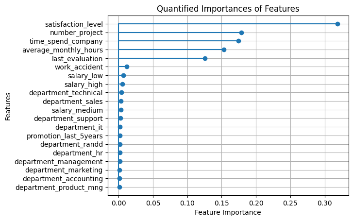
As we can see, we have a sparse set of feature variables. In other words, very few of our features contribute to the outcome of our target variable.
$\approx$ 25% of the features (five out of twenty) are responsible for $\approx$ 95% of the total feature importance.
Create a Dataframe of Our Churn Predictions
Finally, let’s create a dataframe of our churn predictions. Which will mirror df2_processed except for the two additional columns on it’s end. One for the model’s churn prediction and the churn probability score for that given employee.
Then we will export this new dataframe , along with our feature importance dataframe, back to BigQuery. So that we can use them in our Looker Studio dashboard.
1
2
3
4
5
6
7
8
9
10
11
12
13
14
15
#set up intermediary dataframes
X2 = df2_processed.drop(columns = ['quit_the_company', 'employee_id'])
df_ids = df2_processed[['quit_the_company' ,'employee_id']]

#X_train, y_train, id_train, X_test, y_test, id_test = train_test_split(X2, y2, df_ids, test_size=0.2 , random_state = 42 )


y_pred_final = model_rf.predict(X2)
y_pred_proba = model_rf.predict_proba(X2)[:,1]

#final df with quit_the_company + predictions + churn proba

df2_final = df2_processed
df2_final['churn_prediction'] = y_pred_final
df2_final['churn_probability'] = y_pred_proba
Examining Our At-Risk Employees
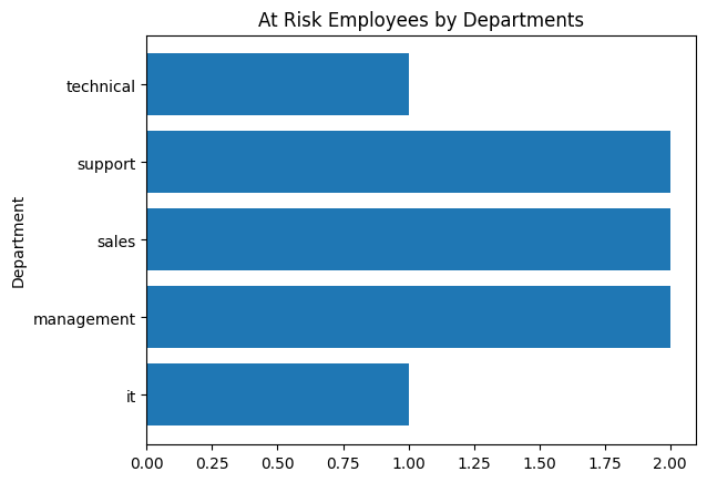
We will create a horizontal bar chart that simply displays the number of employees that are likely to churn, by department.
1
2
3
4
5
6
7
df_churn = df2_final[df2_final['churn_prediction'] == 1]
churn_departments = [x for x in df_churn.columns if x.startswith('department_')]

churn_departments

for x in churn_departments: #rename department columns to omit "department_" prefix
  df_churn.rename( columns = {x : x.split("_")[1]} , inplace = True)
1
2
3
4
5
6
7
Index(['satisfaction_level', 'last_evaluation', 'number_project',
       'average_monthly_hours', 'time_spend_company', 'work_accident',
       'quit_the_company', 'promotion_last_5years', 'employee_id',
       'salary_high', 'salary_low', 'salary_medium', 'it', 'randd',
       'accounting', 'hr', 'management', 'marketing', 'product', 'sales',
       'support', 'technical', 'churn_prediction', 'churn_probability'],
      dtype='object')
1
2
3
4
5
6
7
8
9
df_churn

depart_names_truncated = [x.split("_")[1] for x in churn_departments]

depart_tally = dict()

for x in depart_names_truncated:
  if int(df_churn[x].sum() > 0 ): # only include departments with a nonzero count
    depart_tally[x] = int(df_churn[x].sum()) #sum the 1s from the departments column
1
depart_tally
1
{'it': 1, 'management': 2, 'sales': 2, 'support': 2, 'technical': 1}
1
2
3
4
5
plt.barh(depart_tally.keys() , depart_tally.values() )
plt.title("At Risk Employees by Departments")
plt.ylabel("Department")
#plt.xlabel("Count")
plt.show()
1
2
3
df_depchurn = pd.DataFrame.from_dict(depart_tally, orient='index', columns=['count']).reset_index()
df_depchurn.rename(columns={'index': 'department'}, inplace=True)
df_depchurn
| department | count | |
|---|---|---|
| 0 | it | 1 |
| 1 | management | 2 |
| 2 | sales | 2 |
| 3 | support | 2 |
| 4 | technical | 1 |
Determine the average values for each of the top 5 features for those at risk of churning
1
2
3
4
5
6
7
8
9
means = dict()

for x in df_feats['feature'][0:5]: #iterate through the most important features
  means[x] = float(df_churn[x].mean())

means

df_churn_avgs = pd.DataFrame.from_dict(means, orient= 'index' , columns = ['average'] )
df_churn_avgs
| average | |
|---|---|
| satisfaction_level | 0.275993 |
| number_project | 3.875000 |
| time_spend_company | 3.375000 |
| average_monthly_hours | 275.250000 |
| last_evaluation | 0.504686 |
7. Export to BigQuery
1
2
3
4
5
6
7
8
9
10
11
12
13
14
15
16
17
18
19
#send feature importance dataframe to a BigQuery table
df_feats.to_gbq('employeedata.feature_table',
                project_id ,
                chunksize=None,
                if_exists='replace')

#send at-risk count by department dataframe to a BigQuery table
df_depchurn.to_gbq('employeedata.at_risk_dept_count',
                   project_id,
                   chunksize = None,
                   if_exists = 'replace')


#send average values for at-risk employees dataframe to a BigQuery table

df_churn_avgs.to_gbq('employeedata.at_risk_avgs',
                     project_id,
                     chunksize = None,
                     if_exists = 'replace')
1
2
3
4
5
#send our final predictions to BigQuery
df2_final.to_gbq('employeedata.churn_predictions',
                project_id,
                chunksize=None,
                if_exists ='replace')
8. Conclusion
Recommendations for addressing employee churn:
- Employee Recognition Program: Acknowledging and rewarding employees could boost job satisfaciton and motivaiton, addressing a key factor in reducing turnover.
- Professinal Development Initiatives: Investing in training and development helps employees grow within the company, increasing their commitment and job satisfaction.
- Reward Long Term Employees: Offering retention incentives encourages long-term commitment, addressing the importance of time spent with the company.
Note. Below you will find an image preview of the dashboard with an embedded link to the actual Looker dashboard.