
Visualizing NYC Park Ranger Data with SQL, Python,& Tableau
Introduction
The primary dataset used in this post contains information about requests (in the form of calls) for animal assistance to urban park rangers in New York City parks. It is updated semi-annually and was first made public in 2018. The data is collected and shared by the Department of Parks and Recreation (DPR).
We have analyzed this data to gain insights into when and where calls are commonly made. For what reasons calls are made, the outcomes for the animals involved in these calls, the conditions of the animals in these calls, and the nature of the resources used in response to these calls.
Datasets
Urban Park Ranger Animal Condition Response
Tools Utilized
- DB Browser for SQLite
- Jupyter Lab
- Tableau
Guiding questions
- Species occurrence & Time of year (Season). Is there a change in how often a given species is the subject of a call throughout the year? Does the frequency of the species vary significantly between seasons?
- Condition & Outcome. Is there a relationship between an animal’s reported condition and the final action of a ranger ?
- Condition Counts in Each Borough. Do the reported conditions of animals in these calls vary signficantly between the five boroughs ?
- Distribution of hours of calls. Does the distribution of hours of the initial call vary at all between the five boroughs ?
- Map of call locations per species. Can we create a visual that shows the call locations for the most commonly called in species ?
- ESU & Police Responses. How many calls required the assistance of the police ?
1. Data Pre-Processing
First we changed the data types of specific columns.
1
2
df = pd.read_csv('Urban_Park_Ranger_Animal_Condition_Response_20251107.csv')
df.info()
1
2
3
4
5
6
7
8
9
10
11
12
13
14
15
16
17
18
19
20
21
22
23
24
25
26
27
28
29
<class 'pandas.core.frame.DataFrame'>
RangeIndex: 6385 entries, 0 to 6384
Data columns (total 22 columns):
#   Column                            Non-Null Count  Dtype
---  ------                            --------------  -----
0   Date and Time of initial call     6385 non-null   object
1   Date and time of Ranger response  6385 non-null   object
2   Borough                           6385 non-null   object
3   Property                          6384 non-null   object
4   Location                          6343 non-null   object
5   Species Description               6382 non-null   object
6   Call Source                       6385 non-null   object
7   Species Status                    6324 non-null   object
8   Animal Condition                  5685 non-null   object
9   Duration of Response              6385 non-null   float64
10  Age                               6385 non-null   object
11  Animal Class                      6385 non-null   object
12  311SR Number                      3002 non-null   object
13  Final Ranger Action               6385 non-null   object
14  # of Animals                      6381 non-null   float64
15  PEP Response                      6384 non-null   object
16  Animal Monitored                  6383 non-null   object
17  Rehabilitator                     769 non-null    object
18  Hours spent monitoring            908 non-null    float64
19  Police Response                   6383 non-null   object
20  ESU Response                      6385 non-null   bool
21  ACC Intake Number                 1670 non-null   object
dtypes: bool(1), float64(3), object(18)
memory usage: 1.0+ MB
All timestamp columns were converted into datetime data type, the PEP, Animal Monitored, ESU, and Police Response columns were converted into the bool type.
1
2
3
4
cols = ["Date and Time of initial call","Date and time of Ranger response"]

for x in cols:
    df[x] = pd.to_datetime(df[x], yearfirst=True)
1
2
3
4
5
6
cols_bool = ["PEP Response","Animal Monitored", "Police Response", "ESU Response"]

#df[cols_bool].astype("bool")

for x in cols_bool:
    df[x] = df[x].astype("bool")
2. Investigation and Visualization
Species occurrence vs Time of Year (Season)
First we focused on the borough of Manhattan and made a new dataframe that contains a column for the season that each call occurred in, based on the timestamp of the call in "Date and Time of initial call".
We used that dataframe to plot the frequency at which certain animal species were the subject of a call over the four seasons of the year; utilizing an area chart. We focused on the top five most commonly called in animal species , otherwise the area chart would get too chaotic.
1
2
3
4
5
6
7
8
9
10
11
12
13
def get_season(date_dt):
    date_str = str(date_dt)[:10]
    date_no_time = dt.datetime.strptime(date_str,"%Y-%m-%d")
    month = date_no_time.month

    if month in [12,1,2] :
        return "Winter"
    elif month in [3,4,5]:
        return "Spring"
    elif month in [6,7,8]:
        return "Summer"
    elif month in [9,10,11]:
        return "Autumn"
1
2
df_manhattan_seasons = df[df["Borough"] == "Manhattan"].copy()
df_manhattan_seasons["Season"] = df_manhattan_seasons["Date and Time of initial call"].apply(get_season)
Then we created and populated the rows of our final dataframe.
1
2
3
4
5
6
7
8
9
10
seasons = ['Winter','Spring','Summer','Autumn']
top5_manhattan_species = df_manhattan_seasons["Species Description"].value_counts().nlargest(5).index
df_man_species_seasons = pd.DataFrame(df_manhattan_seasons, columns=seasons, index=top5_manhattan_species) #dataframe for our area plot


for x in top5_manhattan_species:
    for y in seasons:
        df_man_species_seasons.loc[x, y] = int(len(df_manhattan_seasons.loc[(df_manhattan_seasons["Species Description"] == x) & (df_manhattan_seasons["Season"] == y)]))

df_man_species_seasons
| Winter | Spring | Summer | Autumn | |
|---|---|---|---|---|
| Species Description | ||||
| Raccoon | 56.0 | 93.0 | 302.0 | 101.0 |
| Red-tailed Hawk | 41.0 | 24.0 | 41.0 | 27.0 |
| Canada Goose | 19.0 | 36.0 | 42.0 | 30.0 |
| Eastern Gray Squirrel | 24.0 | 23.0 | 18.0 | 27.0 |
| Mallard Duck | 8.0 | 20.0 | 26.0 | 10.0 |
When creating the area chart I opted to not have the area stacked as I felt that a stacked area chart for this data could produce a misleading visual.
1
2
3
4
5
6
7
8
9
10
11
12
13
14
15
16
17
max_val = int(df_man_species_seasons.max().nlargest(1).values[0])
area_yticks = range(0,max_val + 20 ,20)
seasons = ['Winter','Spring','Summer','Autumn']

df_man_species_seasons_t = df_man_species_seasons.transpose()

df_man_species_seasons_t.plot.area(
                       stacked=False,
                       yticks=area_yticks,
                       figsize = (25,10),
                       alpha=0.35 ,
                       xlabel='Season',
                       ylabel='Number of calls',
                       title='Number of calls per (top 5) species per season in Manhattan'
)
plt.tight_layout()
plt.show()
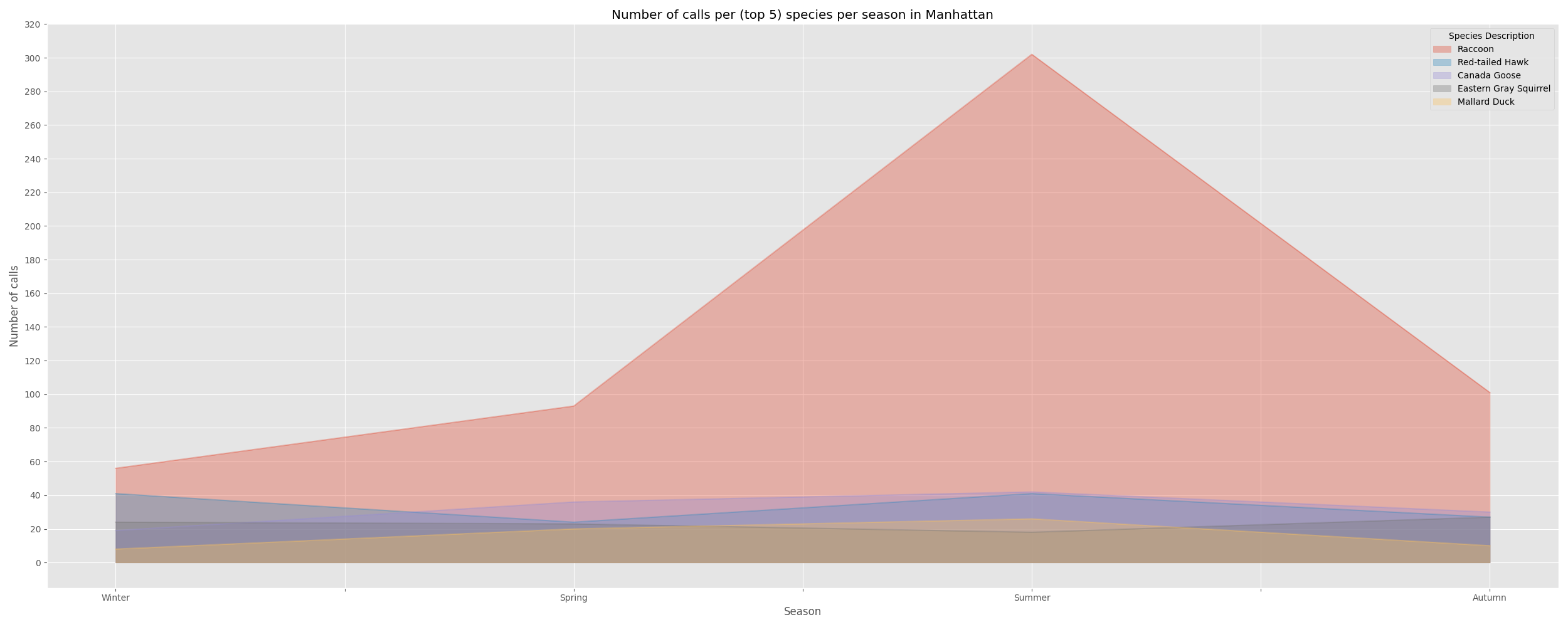
We can see that the number of calls for Raccoons peaks in the Summer in Manhattan and are at their lowest in the Winter. This seems to be in line with the fact that raccoons enter a hibernation-esque state called torpor in the Winter. Albeit, entering this state requires the average daily temperature to be quite low and I am not sure if NYC gets cold enough for a significant number of raccoons to enter torpor.
Calls for Red Tail Hawks and Eastern Gray Squirrels appear to peak in the Winter , while Canadian Geese and Mallard Duck calls peak in the Summer.
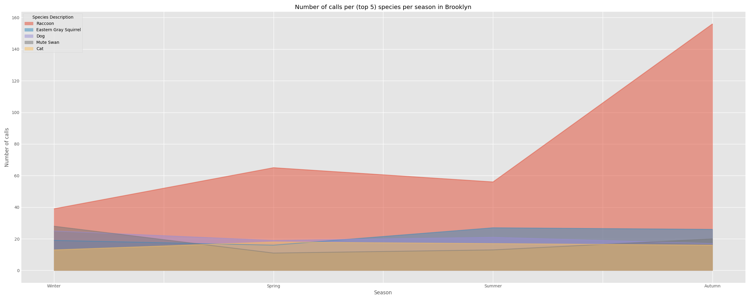
We proceeded to create similar area charts for the next five boroughs, starting with Brooklyn.
1
2
3
4
5
6
7
8
9
10
11
12
#create intermediate dataframe
df_brooklyn_seasons = df[df["Borough"] == "Brooklyn"].copy()
df_brooklyn_seasons["Season"] = df_brooklyn_seasons["Date and Time of initial call"].apply(get_season)


top5_brooklyn_species = df_brooklyn_seasons["Species Description"].value_counts().nlargest(5).index
df_bk_species_seasons = pd.DataFrame(df_brooklyn_seasons, columns=seasons, index=top5_brooklyn_species)


for x in top5_brooklyn_species:
    for y in seasons:
        df_bk_species_seasons.loc[x, y] = int(len(df_brooklyn_seasons.loc[(df_brooklyn_seasons["Species Description"] == x) & (df_brooklyn_seasons["Season"] == y)]))
1
2
3
4
5
6
7
8
9
10
11
12
13
14
15
max_val = int(df_bk_species_seasons.max().nlargest(1).values[0])
area_yticks = range(0,max_val + 20 ,20)
seasons = ['Winter','Spring','Summer','Autumn']

df_bk_species_seasons_t = df_bk_species_seasons.transpose()

df_bk_species_seasons_t.plot.area(
                       stacked=False,
                       yticks=area_yticks,
                       figsize = (25,10),
                       xlabel='Season',
                       ylabel='Number of calls',
                       title='Number of calls per (top 5) species per season in Brooklyn'
)
plt.show()
I won’t post the code snippets for the next four boroughs as the code is quite repetitive with only a few characters changed here and there.
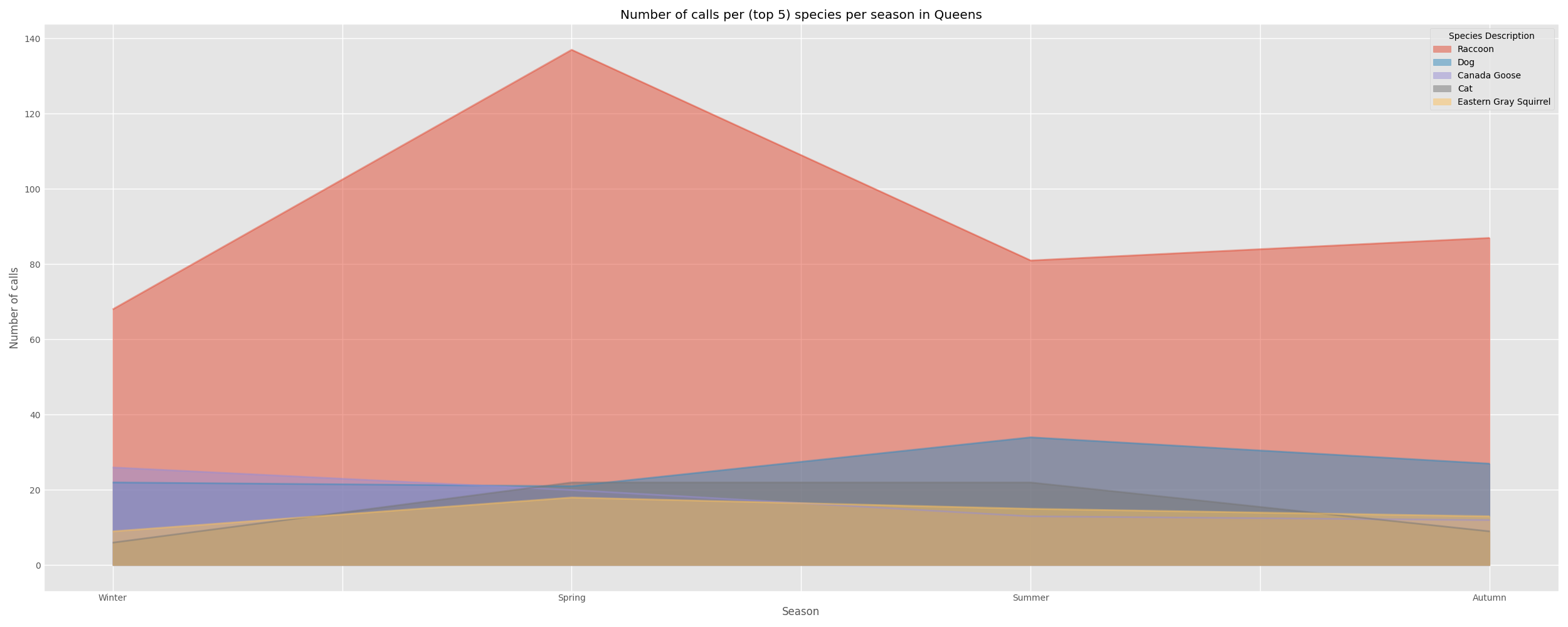
Queens
| Winter | Spring | Summer | Autumn | |
|---|---|---|---|---|
| Species Description | ||||
| Raccoon | 68.0 | 137.0 | 81.0 | 87.0 |
| Dog | 22.0 | 21.0 | 34.0 | 27.0 |
| Canada Goose | 26.0 | 20.0 | 13.0 | 12.0 |
| Cat | 6.0 | 22.0 | 22.0 | 9.0 |
| Eastern Gray Squirrel | 9.0 | 18.0 | 15.0 | 13.0 |
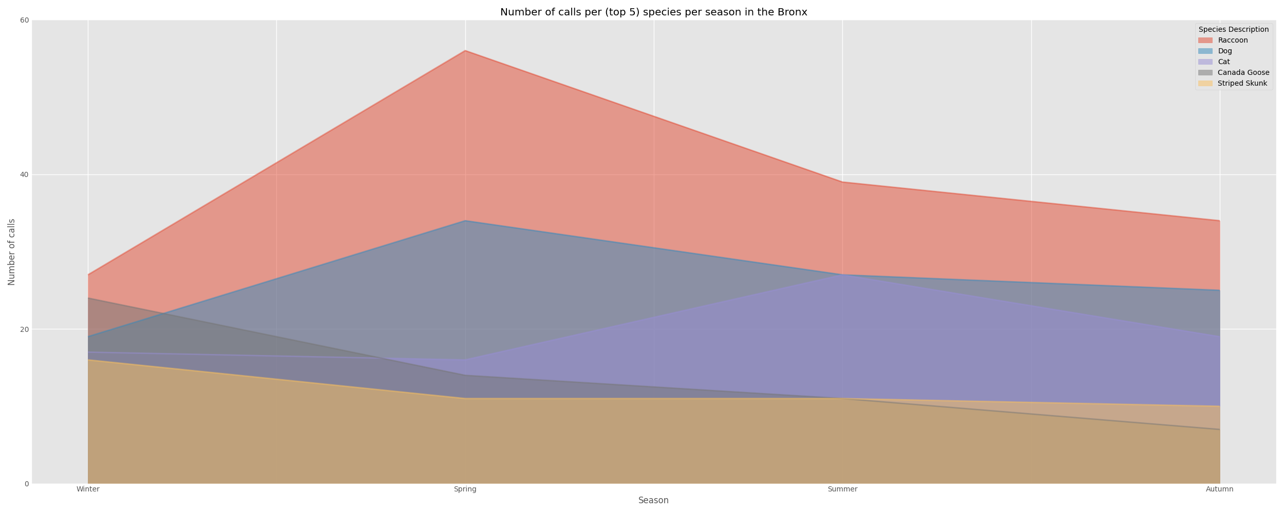
The Bronx
| Winter | Spring | Summer | Autumn | |
|---|---|---|---|---|
| Species Description | ||||
| Raccoon | 27.0 | 56.0 | 39.0 | 34.0 |
| Dog | 19.0 | 34.0 | 27.0 | 25.0 |
| Cat | 17.0 | 16.0 | 27.0 | 19.0 |
| Canada Goose | 24.0 | 14.0 | 11.0 | 7.0 |
| Striped Skunk | 16.0 | 11.0 | 11.0 | 10.0 |
Staten Island
| Winter | Spring | Summer | Autumn | |
|---|---|---|---|---|
| Species Description | ||||
| Canada Goose | 34.0 | 34.0 | 36.0 | 16.0 |
| Raccoon | 29.0 | 24.0 | 24.0 | 9.0 |
| White-tailed Deer | 23.0 | 8.0 | 14.0 | 21.0 |
| Common Snapping Turtle | 0.0 | 20.0 | 12.0 | 6.0 |
| Domestic Duck | 8.0 | 9.0 | 8.0 | 12.0 |
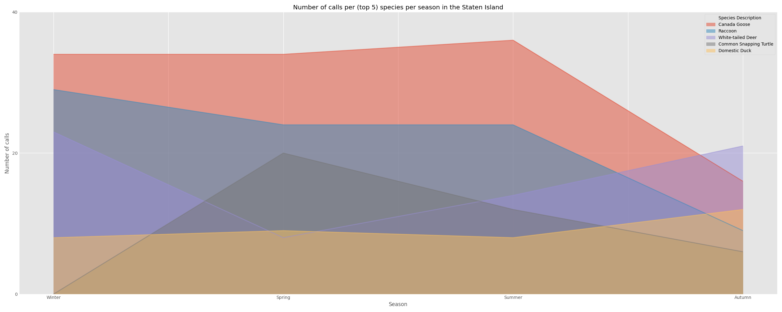
The most common wildlife in Manhattan , Brooklyn, and Queens were mostly similar , while Staten Island appeared to have quite disparate wildlife being commonly called in for. Nearly all boroughs except Brooklyn have both Raccoons and Geese in their top five most commonly called in species.
The peak seasons for these top animal species differed between the boroughs. For example, in Brooklyn the peak season for raccoon calls was Autumn while in Manhattan it was the Summer. I can not think of a viable explanation for this other than a suspicion that the slightly different geography of the boroughs may have something to do with this variance in peak seasons or that the seasons in which tourism peaks in each borough may have impacted these numbers.
Animal condition and outcome
We created a Sankey diagram in Tableau to show how the outcome of the calls (e.g. whether the animal was monitored or sent to an Animal Care Center (ACC)) tends to pair with the condition of the animal being called in for.
We used Tableau for two reasons:
- It’s ease of use
- To add some diversity to our toolset
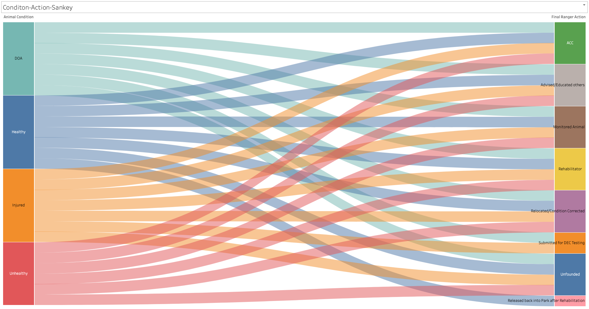
From the sankey chart, we can see that most ranger final actions have a call pertaining to an animal in one of all four conditions. With "Released back into Park after Rehabilition"and "Submitted for DEC Testing" being the two exceptions.
As only healthy animals were released back into the park after Rehabilitation and only injured or dead animals were submitted for DEC testing.
1
df.loc[df["Final Ranger Action"] == "Rehabilitator" ,"Animal Condition"].value_counts()
1
2
3
4
5
6
Animal Condition
Injured      447
Unhealthy    220
Healthy      123
DOA            2
Name: count, dtype: int64
We can see that this was only the case for two calls. Let’s take a closer look at these calls.
1
df.loc[(df["Final Ranger Action"] == "Rehabilitator") & (df["Animal Condition"] =="DOA")]
| Date and Time of initial call | Date and time of Ranger response | Borough | Property | Location | Species Description | Call Source | Species Status | Animal Condition | Duration of Response | … | 311SR Number | Final Ranger Action | # of Animals | PEP Response | Animal Monitored | Rehabilitator | Hours spent monitoring | Police Response | ESU Response | ACC Intake Number | |
|---|---|---|---|---|---|---|---|---|---|---|---|---|---|---|---|---|---|---|---|---|---|
| 3748 | 2022-07-17 12:10:00 | 2022-07-17 12:45:00 | Brooklyn | Benson Playground | 62nd Police Precinct | Great Horned Owl | Other | Native | DOA | 1.0 | … | 311-11051609 | Rehabilitator | 1.0 | False | False | Wild Bird Fund | NaN | False | False | NaN |
| 4956 | 2023-06-08 10:20:00 | 2023-06-08 10:45:00 | Manhattan | Central Park | 59th Street & 7th Avenue, inside the park | Red-tailed Hawk | WBF | Native | DOA | 0.5 | … | 311-14747847 | Rehabilitator | 1.0 | False | False | Wild Bird Fund | NaN | False | False | NaN |
Here we two different cases, across two different boroughs, nearly a year apart. Both for birds of prey that were found to be dead. While the call source “WBF” is not mentioned in the data dictionary , I imagine it stands for World Bird Fund, which is ultimately where the Red-Tailed hawk was taken.
We took a closer look at how the calls were distributed across the different ranger actions with the use of multiple bar charts.
1
2
3
4
5
6
7
8
9
10
11
12
13
14
15
16
17
18
19
20
21
22
23
24
25
26
27
fig, ((ax1,ax2),(ax3,ax4)) = plt.subplots(2, 2, figsize=(10, 10), sharey=True)

#axes_list = [ax1,ax2,ax3,ax4]

#ax1 - Healthy
df.loc[df["Animal Condition"] == "Healthy","Final Ranger Action"].value_counts().plot(kind='bar',
                                                                                           ax = ax1)
ax1.set_title("Final Ranger Action for Healthy Animals")

#ax2 - Injured
df.loc[df["Animal Condition"] == "Injured","Final Ranger Action"].value_counts().plot(kind='bar',
                                                                                           ax = ax2)
ax2.set_title("Final Ranger Action for Injured Animals")

#ax 3 - Unhealthy
df.loc[df["Animal Condition"] == "Unhealthy","Final Ranger Action"].value_counts().plot(kind='bar',
                                                                                           ax = ax3)
ax3.set_title("Final Ranger Action for Unhealthy Animals")

#ax4 - DOA
df.loc[df["Animal Condition"] == "DOA","Final Ranger Action"].value_counts().plot(kind='bar',
                                                                                           ax = ax4)
ax4.set_title("Final Ranger Action for DOA Animals")

fig.suptitle("Distribution of final ranger action for each animal condition")
plt.tight_layout()
plt.show()
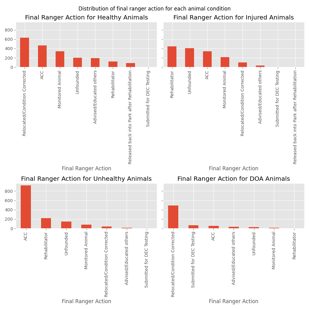
We can see that ACC appears in the top three final actions for all animal conditions. With healthy animals more likely to be relocated or have their condition corrected. Injured animals likely to be sent to a rehabilitator, unhealthy animals most likely to be sent to an ACC, and DOA animals (unsurprisingly) most likely to be relocated.
Condition counts per borough
We created visuals to display the value counts for the various animal conditions (e.g. Healthy, Injured, Unhealthy, DOA). We first attempted to do this via a heatmap.
We started by creating a new dataframe from df, called df_condition. Where the boroughs were the index and the columns were the various animal conditions.
1
2
3
4
5
6
7
8
9
10
11
12
13
boroughs = df["Borough"].unique().tolist()
conditions = df["Animal Condition"].dropna().unique().tolist()

cond_borough_dict = dict()

for x in boroughs :
   cond_borough_dict[x] =  df.loc[df["Borough"] == x , "Animal Condition"].value_counts().values.tolist()


df_condition = pd.DataFrame.from_dict(cond_borough_dict, orient = "Index" , columns = conditions)
df_condition

sns.heatmap(df_condition, annot = True , fmt = ".0f")
| Healthy | Injured | Unhealthy | DOA | |
|---|---|---|---|---|
| Brooklyn | 404 | 343 | 332 | 112 |
| Bronx | 349 | 201 | 190 | 114 |
| Staten Island | 308 | 284 | 148 | 135 |
| Queens | 465 | 378 | 310 | 144 |
| Manhattan | 513 | 424 | 349 | 182 |
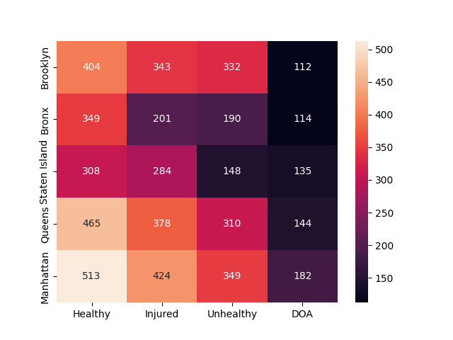
While this heatmap is preferable to a table, I believe we could find a more effective visualization method in the form of a bar chart.
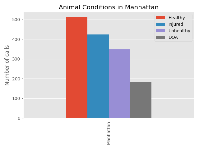
Below we compared the counts of the animals’ conditions for each call, per each borough, using a vertical bar chart. I found this visual to be much more effective at comparing the relative counts of each animal condition between the five boroughs. Let’s take a look at the bar chart for Manhattan.
1
2
3
4
5
6
df_condition[df_condition.index=='Manhattan'].plot(kind='bar' ,
                                                   #color = ['lightgreen','purple','orange','salmon'],
                                                   title='Animal Conditions in Manhattan',
                                                   ylabel='Number of calls'
                                                    )
plt.show()
Let’s compare all five boroughs now.
1
2
df_condition.plot(kind='bar')
plt.legend(loc='upper center')
The majority of calls are placed for animals that are in a suboptimal state, in regards to their health. The distribution of animals in each condition category for each borough appears to be mostly similar.
With Staten Island differing slightly from the rest with around only 16% of its calls including an unhealthy animal. And a relatively high percentage of its calls ($\approx$ 33%) involving an injured animal. This could be for a number of reasons. Perhaps people on Staten Island are less likely to place a call for an park dwelling animal that would be classified as unhealthy, or maybe animals on Staten Island are less likely to be classified as unhealthy (for any number reasons), or maybe animals on Staten Island are generally healthier than those in other more populated boroughs. I can’t make a definitive conclusion with the information that I have at hand.
Distribution of the hours of calls
We took a look at the distribution of the hours that calls were placed. Looking to see if calls tended to concentrate in specific hours or if calls were more consistently distributed across a twenty-four hour period.
We achieved this by creating six histogram plots. One for each borough and one for all five boroughs. Placing all six histograms on the same figure with matplotlib and pandas.
1
2
3
4
5
6
7
8
9
10
11
12
13
14
15
16
17
18
19
20
21
22
23
24
25
26
27
28
29
30
manhattan_hours = df.loc[df["Borough"] == "Manhattan","Date and Time of initial call"].dt.hour
brooklyn_hours = df.loc[df["Borough"] == "Brooklyn","Date and Time of initial call"].dt.hour
queens_hours = df.loc[df["Borough"] == "Queens" , "Date and Time of initial call"].dt.hour
bronx_hours = df.loc[df["Borough"] == "Queens","Date and Time of initial call"].dt.hour
si_hours = df.loc[df["Borough"]=="Staten Island", "Date and Time of initial call"].dt.hour

fig, ((ax1,ax2,ax3),(ax4,ax5,ax6)) = plt.subplots(2, 3, figsize=(12, 10), sharey=True , sharex=True)

fig.suptitle("Distribution of calls over 24 hours in all 5 boroughs")

ax1.hist(manhattan_hours, bins = 24, color='cyan')
ax1.set_title("Dist. of Manhattan calls (24 hrs)")

ax2.hist(brooklyn_hours, bins=24, color='pink')
ax2.set_title("Dist. of Brooklyn calls (24 hrs)")

ax3.hist(queens_hours, bins=24, color='lightgreen')
ax3.set_title("Dist. of Queens calls (24 hrs)")

ax4.hist(bronx_hours, bins=24, color='gold')
ax4.set_title("Dist. of Bronx calls (24 hrs)")

ax5.hist(si_hours,bins=24,color='orange')
ax5.set_title("Dist. of Staten Island calls (24 hrs)")

ax6.hist(df["Date and Time of initial call"].dt.hour,bins=24) #the distribution over all boroughs
ax6.set_title("Dist. of calls overall (24 hrs)")

plt.tight_layout()
plt.show()
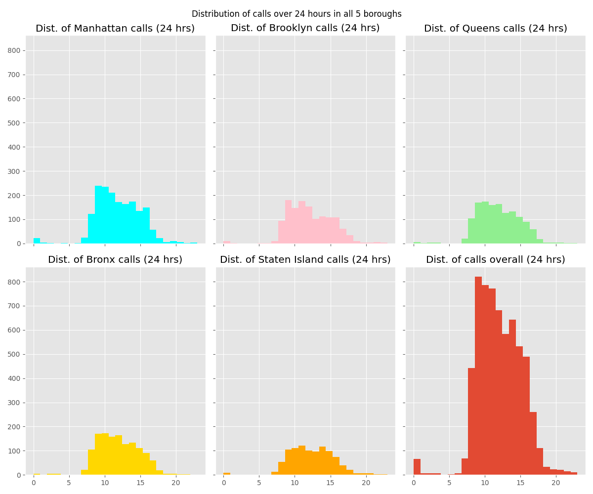
The distribution of calls across the five boroughs are largely similar, with many boroughs having peak call activity in the morning just before noon. We can see that overall calls peak at around 9 AM or so for all five boroughs.
Mapping call locations
In order to map call locations we needed a better way of locating where calls were made based on the information in the Property field. We ended up using this NYC OpenData dataset that contains park property addresses. Joining it with the Property field in our NYC park ranger dataset in order to get the addresses that correspond to each park , wherever possible.
Fields of interest from Parks Properties:
ADDRESS: To be concatenated withBOROUGHandZIPCODE)EAPPLY: Name of the propertyBOROUGHZIPCODE
Note that ZIPCODE often contains multiple entries, possibly due to the size and location of these parks resulting in them occupying more than one zip code. We prevented more than one zip code appearing in our full_address field by utilizing the SUBSTR() function.
The query below was ran in DB Browser for SQLite to join our two datasets.
1
2
3
4
5
6
7
8
9
10
11
12
13
SELECT
	Urban_Park_Ranger_Animal_Condition_Response_20251107.Property as property_name,
	[Species Description]  as species,
	Urban_Park_Ranger_Animal_Condition_Response_20251107.Borough as borough,
	Parks_Properties_20251202.ADDRESS as property_address,
	CONCAT(Parks_Properties_20251202.ADDRESS,
		" ",
		Urban_Park_Ranger_Animal_Condition_Response_20251107.Borough, ", New York", " ",
		SUBSTR(Parks_Properties_20251202.ZIPCODE,1,5)
		) as full_address
FROM Urban_Park_Ranger_Animal_Condition_Response_20251107
JOIN Parks_Properties_20251202 ON
	Urban_Park_Ranger_Animal_Condition_Response_20251107.Property = Parks_Properties_20251202.EAPPLY
To create the full_address field we simply concatenated ADDRESS, BOROUGH , ", New York" and the first five characters in the ZIPCODE field.
We exported the results of the query into an .xlsx file and imported it into Tableau to create a map visual. Below are the first five rows of the query results.
| property_name | species | borough | property_address | full_address | |
|---|---|---|---|---|---|
| 0 | Haffen Park | Sparrow | Bronx | 1750 BURKE AVENUE | 1750 BURKE AVENUE Bronx, New York 10469 |
| 1 | Willowbrook Park | Raccoon | Staten Island | 1953 RICHMOND AVENUE | 1953 RICHMOND AVENUE Staten Island, New York 1… |
| 2 | Clove Lakes Park | Domestic Duck | Staten Island | 1321 VICTORY BOULEVARD | 1321 VICTORY BOULEVARD Staten Island, New York… |
| 3 | Willowbrook Park | Canada Goose | Staten Island | 1953 RICHMOND AVENUE | 1953 RICHMOND AVENUE Staten Island, New York 1… |
| 4 | Travers Park | Cat | Queens | 33-16 78 STREET | 33-16 78 STREET Queens, New York 11372 |
We could have retrieved the longitude and latitude of each park with a valid address using a python library such as GeoPy and then exported the resulting dataframe to an excel or csv file to be used in Tableau for more precise location markings.
But instead we imported the file into Tableau as is, where the zip code was used to determine where to mark locations on the map.
We created a visual in tableau that shows the crude location of calls made for a specific species. Limiting the number of species displayed to the top 10 most commonly called in species. The sankey chart was also included in this dashboard.
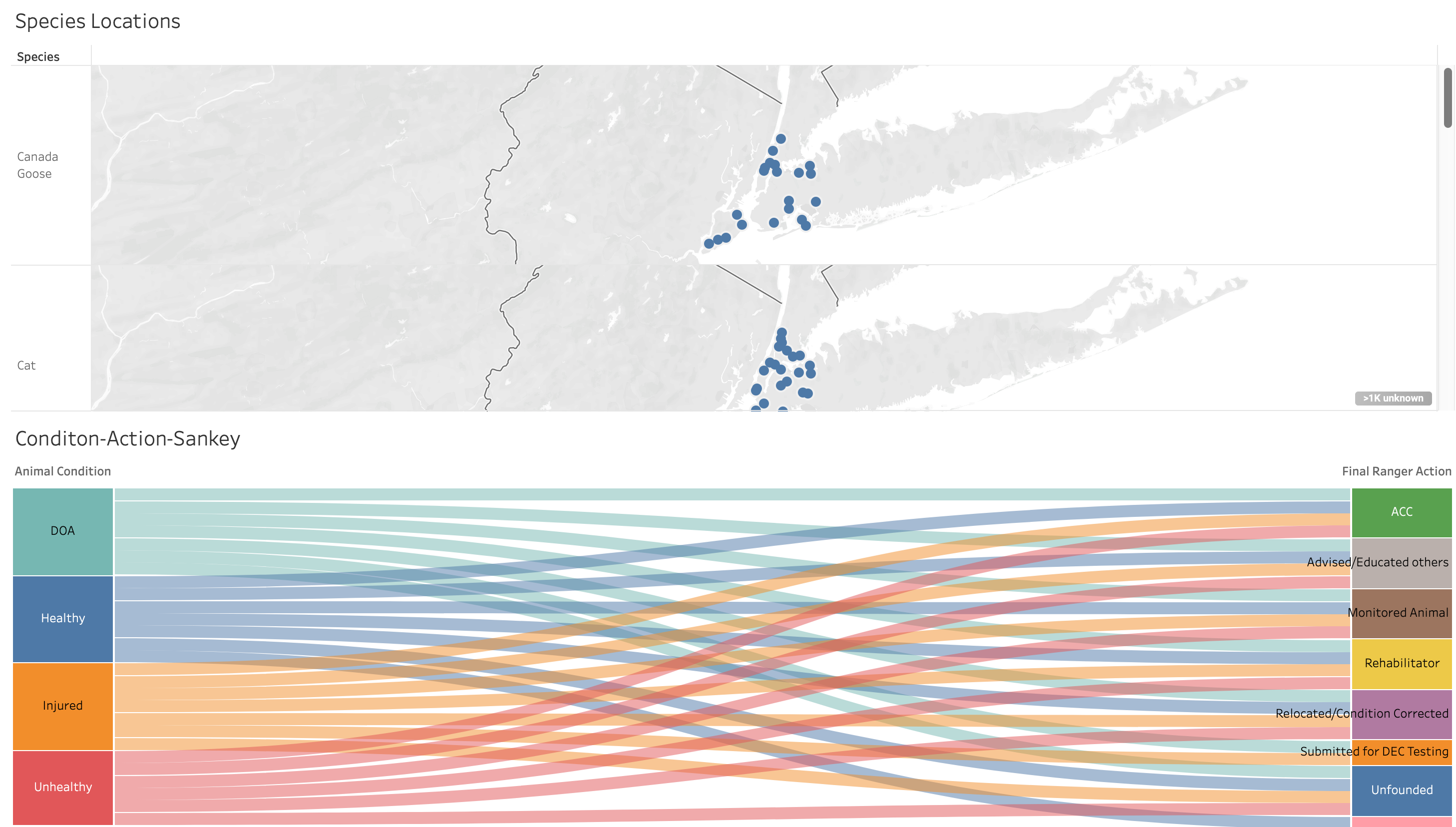
We can see that the Canadian Goose, Mallard Duck, and Mute Swan calls appear to be concentrated at zip codes that are closer to bodies of water. While calls for dogs and other mammals seem to be dispersed over an array of locations.


ESU and police responses
Finally we determined how many calls result in assistance from the police. Note that ESU is short for the NYPD’s Emergency Service Unit.
1
2
3
4
5
6
7
8
9
10
11
12
13
14
15
16
17
18
19
20
21
22
#create our dataframe of esu/police responses
df_res = df[['Species Description','ESU Response','Police Response']]
df_res = df_res.set_index('Species Description')
df_res

species = df_res.index.unique().tolist()
species_dict= dict()

for x in species:
    df_tmp = (df_res[df_res.index == x])
    species_dict[x] = [df_tmp['ESU Response'].sum(), df_tmp['Police Response'].sum()]
species_dict

df_res_final = pd.DataFrame.from_dict(species_dict,orient='index',columns=['ESU Responses','Police Responses'])
df_res_final.replace(np.nan,0)
df_res_final.nlargest(9, 'ESU Responses').plot(kind='barh',
                                              xticks=range(0,26,2),
                                               title='Number of ESU or Police Responses',
                                               ylabel='Species',
                                               xlabel='Count')
plt.tight_layout()
plt.show()
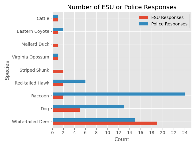
You can see from the x-axis that very few calls result in the police getting involved. Raccoons have the most calls that required a police presence, likely due to their skills in thievery.
Jokes aside, most of these cases resulted in the Raccoon(s) being taken to an animal care center (ACC). While a slim majority of them resulted in educating the caller or relocating the Raccoon.
1
df.loc[(df["Species Description"] == 'Raccoon') & (df["Police Response"] == True),"Final Ranger Action"].value_counts()
1
2
3
4
5
6
7
Final Ranger Action
ACC                              13
Unfounded                         4
Monitored Animal                  3
Advised/Educated others           2
Relocated/Condition Corrected     2
Name: count, dtype: int64
1
df.loc[(df["Species Description"] == 'Raccoon') & (df["Police Response"] == True),"Animal Condition"].value_counts()
1
2
3
4
5
6
Animal Condition
Unhealthy    14
Healthy       5
Injured       2
DOA           1
Name: count, dtype: int64
Most of these calls were for unhealthy, injured, or dead Raccoons. And the call that required the longest response was for an unhealthy Raccoon in Central Park that was monitored for 3.5 hours and ultimately taken to an animal care center.
1
df.loc[3411]
1
2
3
4
5
6
7
8
9
10
11
12
13
14
15
16
17
18
19
20
21
22
23
Date and Time of initial call                                     2018-08-09 07:30:00
Date and time of Ranger response                                  2018-08-09 09:00:00
Borough                                                                     Manhattan
Property                                                                 Central Park
Location                            E 102nd St and East Drive.  South of Compost Hill
Species Description                                                           Raccoon
Call Source                                         Conservancies/"Friends of" Groups
Species Status                                                                 Native
Animal Condition                                                            Unhealthy
Duration of Response                                                              4.0
Age                                                                             Adult
Animal Class                                                        Small Mammals-RVS
311SR Number                                                           1-1-1599116596
Final Ranger Action                                                               ACC
# of Animals                                                                      1.0
PEP Response                                                                    False
Animal Monitored                                                                 True
Rehabilitator                                                                     NaN
Hours spent monitoring                                                            3.5
Police Response                                                                  True
ESU Response                                                                    False
ACC Intake Number                                                               37618
Name: 3411, dtype: object
We proceeded to create a waffle chart ,for Raccoon calls specifically, to demonstrate how minuscule the proportion of these calls are.
1
2
3
4
5
6
7
8
9
10
11
12
13
14
15
16
17
18
19
20
21
22
23
24
25
26
27
df_raccoon = df[df["Species Description"].str.contains("raccoon", case=False, na=False)]

esu_count = df_raccoon["ESU Response"].sum()
police_count = df_raccoon["Police Response"].sum()
total = len(df_raccoon)

values = {
    "ESU Responses": esu_count,
    "Police Responses": police_count ,
    "Total": total
}

fig = plt.figure(
    FigureClass=Waffle,
    rows=50, columns=50,
    values=values,
    cmap_name ='tab20',
    legend={
        'loc': 'center left',
        'bbox_to_anchor': (0, -0.1),
        'ncol': 2,
        'labels': [f"{k} ({v})" for k, v in values.items()]
    }
)
plt.title("Raccoon – ESU vs Police Responses")
plt.tight_layout()
plt.show()
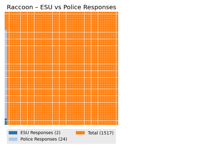
Looking at the waffle chart for all Raccoon calls, the most commonly called in for species, we can see that the proportion of calls that end up necessitating an ESU or Police response are quite small.
3. Conclusion
From our analysis we learned the following :
- The species of the animal in the call varies over seasons and boroughs
- e.g. Raccoons have different peak seasons between Brooklyn (Autumn) and Manhattan (Summer)
- Most calls resulting in an animal either being relocated, sent to a rehabilitator , or being sent to an ACC
- The distribution of animal conditions was similar between boroughs
- Peak calling hours tend to lie between 9 AM and 12 PM
- Calls for aquatic birds tend to be concentrated near bodies of water
- A small minority of calls require assistance from the police, with most of those calls being for raccoons or white-tailed deer